Here are a series of Questions with Answers to them on different aspects of the Tri-Color Triangle ™ that have been brought up by various concerned parties. Some of these were actual questions, some hypothetical, some with the implied question being paraphrased. They will hopefully serve to shed more insight into why this upgrade to an existing device needs to be utilized and put to rest some misconceptions on why the existing SMV emblem is supposedly “good enough.”

Q. Why reinvent the venerable “tractor triangle?”
A. “While attaining widespread use and institutional acceptance in its (50) years on the road, crash data indicate that the slow-moving vehicle (SMV) emblem may not be meeting the safety needs of either the motoring public or SMV operators. (The article excerpted here) addresses the possibility that the reasons for this include its inconsistent day/night appearance, potential confusion with other roadway symbols, its uncontrolled misuse, and poor driver education.”
From the article’s conclusions: “… and perhaps emblem modification (is needed) to make it more iconic* in nature or at least to ensure that it appears the same to approaching drivers in daylight and at night.“
—Excerpted from an article in the Journal of Agricultural Safety and Health (published by the ASABE), “Motorist Comprehension of the Slow Moving Vehicle Emblem” by P. M. Garvey… the full text of which can be accessed by members and non-members at this address (link); non-members must pay for access.
(*The T-C T’s modifications stay in the realm of “symbolic” vs. “iconic” by definitions in the article. The drawbacks of true iconic emblems are given in the Manitoba study referenced later below.)
Q. Industry has had over 50 years of experience with the present SMV emblem. To change it would detract from its effectiveness. (Why change it?)
A. The goal of practical, applied road safety is not to keep a status quo situation for Industry, i.e., equipment manufacturers, that they are familiar with or “feel comfortable” with. P. M. Garvey’s above-referenced article shows that the present SMV emblem is not particularly effective in use on the road in many regards.
Q. The present SMV emblem is well-recognized by the public; changing the shape will require re-education. It takes a long time to educate the public and too many changes tend to frustrate people. (Why change it?)
A. Again, per Garvey’s article, the current emblem is not particularly well-recognized. A second study of motorist comprehension of the emblem among motorists in Manitoba, Canada, was conducted and the findings were the same… access as noted previously to that article here (link).
To add the novel aspects of extra stripes, a 3rd color and new elements of “reflectivity*” would likely not require the re-education of all members of the public. Many already familiar with the current emblem would probably instantly, instinctively adapt to the new additions… putting 2 + 2 together on the fly without confusion or misinterpretation. Consider: all of the same elements of the old emblem are still in this new variation and in the same colors and even core size. All people are not as dumb as a percentage of people may be.
However, additional education (not true Re-education) would not be a bad thing overall. By giving an augmented, more effective, updated new look to this emblem, it will create a perfect opportunity to give just that education on what SMV emblems are for and why they are used that are already noted as not presently being met–either in drivers’ manuals (as noted in the two above studies) or by any other official or informal means of conveyance. This education could also address the wrongness of emblems being used for mailboxes, etc., and could coincide with an effort to remove them and actually fine offenders. This “problem” is actually “an opportunity in work clothes.”
— Henry J. Kaiser, American Industrialist
Q. Changing the size of the sign would not increase effectiveness of the sign. (Why make it bigger?)
A. In simplest terms, bigger is better, whether the bigger “regular” T-CT or the EVEN bigger “BIG T-CT.” Bigger can be seen from farther away. Visibility from farther away is better. Consider the variety of sizes in stop signs. The specifications in the U.S. vary between 29 1/2″, 35″ and 47″. If only a standard size sign was always adequate, larger signs would not exist.
The overall increase in size for the T-C T is only 3 inches. The increase in size was not the main consideration in designing this variation (though bigger IS better); it is a secondary aspect–and a good one. Advanced thinking at Safety Psychographics is that other sizes of this variation that are EVEN bigger, perhaps 1 and 1/2 to 2 times bigger (now fact & available for sale for your help in testing), would be ideal for some of today’s larger farm machinery that is so much bigger in width and height compared to 50 years ago that SMV emblems can virtually “get lost” in the increased visual real estate confronting motorists, and that bigger emblems to compensate for that are in order as an option or a mandate.
Q. This emblem’s shape is no longer a triangle, but a hexagon. The triangle is well known and recognized… the standard emblem has the good recognition of the triangular shape of the SMV emblem and changing the shape takes away from this recognition. Changing the shape can cause confusion to the uneducated public… this variation diverges from the shape and size used in other countries such as Sweden and India. The triangular shape has been gaining acceptance as the international symbol for slow moving vehicles. The current emblem has underwent several efforts to be accepted internationally and I would not want to delay this process any longer.
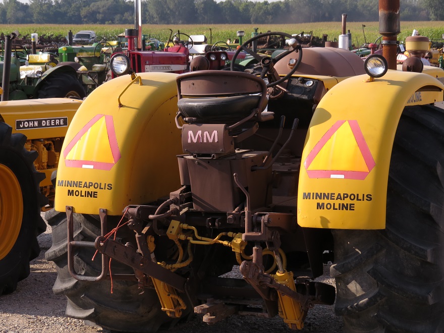
A. The SMV emblem’s shape has always been hexagonal, though one with 3 sides longer and 3 sides shorter. The truncations at what would be the sharp points of the intersections of the red border stripes around the inner orange triangle make what would have been truly triangular into an irregular hexagonal shape. The addition of the 3″ yellow-green outer borders around the red borders nearly, but not quite, makes the outer shape more closely hexagonal. This aspect of it was not by design but as a secondary artifact of the redesign. Increasing the outer stripes even more to make the perimeter an actual hexagon is still possible but not necessarily required to achieve the overall effect. Though it would then look somewhat more consistent as a true hexagon, with either shape variation, the emphasis on the triangle is not lost. Perhaps the commenter is thinking of how the octagonal shape of a stop sign serves to identify it even if it is, for instance, covered with snow. In that circumstance, the perimeter shape is useful for those who can interpret it and indeed stop in time. With the SMV emblem, either the existing standard one or the new, nearly-hexagonal redesign, such a stop sign situation would not come into play. As the emblem is displayed on a vehicle in motion, the relevant aspects of it are the colors and/or the reflectivity, not the shape. If the hypothetical motorist were to come up on a slow moving vehicle that had its emblem obscured but the shape still remained, to make a potential judgement at that point would probably be too late. The presence of the vehicle itself would be more immediate. Also, many emblems are flat up against their vehicles in decal form or flush mounting and no perimeter shape would be discernable.
The designer here at S. P. has a commercial art, design, photography, business, transportation, military vehicle marking, safety and farming background. From a graphics standpoint, the inner orange triangle of the standard SMV emblem has never been adversely affected by its being surrounded by the truncated red stripes… they are a secondary aspect and not overly-wide. The presence of the yellow green stripes, while adding a now even-wider border surrounding the core triangle, still does not take away from that core triangular shape, for they, too, are still truncated and their color is lighter than either the orange or the red. The combined width of the borders as they stand is 4 3/4″; that compares with 12″ for the core triangle. These borders that are not quite 40% of the width of the triangle and their secondary, near-hexagon perimeter shape do not, from a visually-affective design viewpoint now suddenly overwhelm the triangle nor compete with it. Again, the emphasis on the triangle is not lost.
As far as the recognition factor and potential for confusion between the existing and the new shapes, again see Garvey’s report on the notable percentage of lack of recognition of the current shape. This incremental, evolutionary change in appearance can be conveyed easily enough to the part of the public that is already familiar with the current design but does not automatically comprehend the equivalence of the upgrade. It cannot be any harder to comprehend than what the public had to accommodate when stop signs changed from black-on-yellow to white-on-red (or from this style sign:)
 or, even more dramatically, when Sweden and numerous other countries changed overnight from driving on the left to driving on the right, an unpopular move at the time.
In regards to triangles/emblems used in, for example, Sweden and India… the ASABE current style emblem already is what is used internationally on the whole (ISO 16154:2005-303-3.33) and has largely gained official acceptance, with typical problems in getting the would-be end users to actually use them, much as we also experience in the U.S. The vast majority of other countries follow the U.S. lead on adopting our current style emblem(s) for SMV marking purposes. If the T-C T is marketed and used abroad, it does not mean that people in other countries would have inherent problems in recognizing it as a SMV emblem any more so than here at home. There would be no inherent reason for its appearance abroad to cause people in other countries to suddenly not treat existing style emblems as anything but what they are nor would they not be able to make the connection that this new style is a logical evolution of the older style. Other countries and the ISO, as the conveyor of standards of used in other countries, likely want to be also use the best and most-current designs… unlikely to be satisfied with settling for safety devices that aren’t of the most effective, modern types.
Q. Do not change the color of the sign. We have good recognition of the current two colors. Adding a third color adds confusion and we do not want to reduce the size of the red and orange. Why add confusion or make the red and orange smaller?
A. The recognition of the existing two colors is not the best; again, see Garvey’s paper. See previous answers here re: “confusion.” If you haven’t noted it yet, the overall size is bigger… the red and orange are the same size, not smaller.
Q. For additional marking of wide and long agricultural equipment on the road,
yellow retroreflective material is specified to be visible to the front and sides. The new material of the T-C T brings a “yellow” color to the rear, confusing the message to vehicles overcoming the agricultural machine. In light of this, why has S. P. chosen that yellow-green color as an additional one and why don’t they instead utilize a different color than this “shade of yellow?”
A. There is a real and practical difference between common yellow retroreflective material and the scientifically-developed specific shade of fluorescent Yellow-Green, a/k/a “safety green, lime green, etc.” The 0.555 μm/0.56 μm spectrum color stimulates the eye in a way that common yellow does not and cannot. On road signs, at least in Berrien County, Michigan (the home of ASABE headquarters), plain yellow “reflective*” signs are being replaced by fluorescent/retroreflective yellow signs. Fluorescent yellow-green signs have replaced most of the plain yellow signs that were previously used at crosswalks and for school zones. The state and national Departments of Transportation do not use these old and new colors interchangeably nor, for new locations, allow arbitrary choices to be made on which styles/shades to use for whichever types of signs.
The T-C T does not use Yellow as the additional color so it does not send a potentially confusing message to vehicles coming up on the rear of such equipment that is utilizing it.
Q. The Tri-Color Triangle ™ has a center orange triangle that differs from conventional emblems for not being just fluorescent only but is both fluorescent and retroreflective. Therefore, the nighttime only–hollow red triangle appearance would be eliminated and parameters of the third party communication purpose are changed. (i.e., change away from just the retroreflective red triangle night time appearance is “undesirable.”) Are there existing materials meeting both the retroreflective performance requirements and the fluorescence performance requirements needed for SMV emblems (and do you use them, and, if not, why not just stick with a non-reflective/fluorescent-only center orange section)?
A. The nighttime “hollow red triangle” look of regular SMV emblems is part of the problem with them, “…violating the uniformity of appearance principle” according to the referenced Garvey study and article. It has an “inconsistent day/night appearance and lack of distinctiveness from other roadway symbols,” namely, it is nearly-identical at night to the roadside breakdown triangle (see comparison pictures from Garvey).
“This heterogeneity is a function of the era in which the emblem was originally designed. In 1962, sign material integrating retroreflective and fluorescent qualities did not exist; therefore, for the emblem to be visible both in daylight and at night, it had to be constructed using two types of materials: fluorescent (daylight visibility) and retroreflective (nighttime visibility). The result is a hybrid emblem that is visible in daylight and at night, but visible as two dramatically different images. The driver must therefore know that a solid orange triangle in the daytime and a hollow red triangle at night both have the same meaning.” —Garvey paper
As is made clear above, the hollow red triangle look at night is not exactly a characteristic that was originally intended and is not worth preserving for its historical associations and inadvertent longevity. Now that modern dual-characteristic materials are available, they correct unavoidable compromises of the past and point the way to the future.
These modern dual-nature materials that are used in the T-C T are ones that have met ASABE standards (reflectivity of red border) and D.O.T. standards (reflectivity and fluorescence standards for the orange and yellow-green sections), but testing of the fluorescence of the orange section specifically for current ASABE standards is still underway. While we have every reason to believe that those D.O.T. specs and results are comparable to ASABE specs, there is the possibility that the differences might exist between them, owing to opaque vs. transparent materials’ natures issues. It has been observed, however, that T-C T center orange fluorescent triangle appears brighter than regular emblems’ opaque orange… likely because of the ability of more light to additionally get behind the fluorescent film and “come back out,” along with the light that just reflects (literally) off the surface (as is the case with opaque materials), for an optically-superior end effect for the viewer. Of course, the orange section is complemented by the yellow-green fluorescent outer borders; those stripes adding their additional areas of desirable, measurable fluorescence to what is provided by the orange triangle.
With the now-achieved uniformity of appearance by day and at night for the orange and red sections, “brighter” fluorescence and more of it, including an additional, more effective color, it would not make much sense or serve the users of SMV emblems and the motoring public to be content to stay with the incrementally-improved historical emblem design when this breakthrough has been developed and made available.
Q. The increased size of the T-C T impacts the operator’s field of vision, increasing the likelihood that the operator will permanently remove the emblem… it will cause problems on smaller equipment (tractors) as it will block functions and visibility. Some operators will remove it instead of leaving it on. I had to install the present (older) SMV emblem on various small tractors over the years and have experienced difficulty in trying to find a ‘good place’ to mount the present (smaller) size. When you go larger it will become more difficult to find a place to mount it and it (T-C T) will cause more obstruction and we will find more owners removing them because they ‘are in the way’.
What are you people thinking by making something so big that it hinders more than it helps?
A. Remember, the Tri-Color Triangle ™ is only 3 inches wider on any of the three sides than the historical triangle. Just how much of an impact that those extra three inches will practically affect an operator’s view out their back window (if the emblem is indeed necessarily mounted behind the window) is questionable… only able to be determined on a tractor-by-tractor basis. Permanently mounting an emblem right behind the back window, right in the way of critical views of anything needing monitoring, is not the only option here.
Below are a series of pictures of two relatively small, narrow-tread tractors with minimal rear glass area… one showing the T-C T mounted completely out of the way for all views to the rear–the other showing an alternative factory-provided method with an older style triangle. Note that the 2nd one also utilizes a spade mount for even greater convenience.


Firstly, farmers (and equipment manufacturers) are (or at least should be) clever and resourceful enough to find alternatives to any theoretical “only place it can go… AND IT’S IN THE WAY” situation. The spade-mount system, where the emblem is attached to a basically-flat post with a shaped end, and then that end slips into and back out of a shaped receiver, has been around as long as the emblem has existed. If more farmers and equipment makers availed themselves of this simple mounting system, the T-C T (and any regular emblem) could be mounted just about anywhere preceding road travel in the general area that regulations suggest that they should go and then easily removed when out in the field in needed for greater visibility. If a tractor usually is towing a piece of equipment, a second spade-mount receiver can be mounted on the back of that equipment and the “obscuring” emblem could be taken off of the tractor and put to the far rear where it does the most good. This is an effective cost-savings measure also, minimizing the total number of emblems needed.
This observer has seen a large variety of emblem mounting schemes and locations over the years and has come to the conclusion that there is more than one way to skin a cat. Authoritatively and pessimistically stating that an emblem that’s three whole inches wider will automatically and necessarily cause undue grief, insurmountable problems and the unavoidable course of action of emblem non-use or removal sounds simplistic and disingenuous… a mindset of throwing in the towel when using native talent and American Ingenuity is what is actually called for. It’s agriculture, not rocket science.
Q. Using this somewhat larger emblem on big equipment will cause confusion as to which size emblem is needed to comply with regulations and it serves no purpose (for it to be larger). All large equipment is required to comply with ASAE S279 which identifies the lighting and marking needed on the machine. Making the emblem larger serves no purpose. We currently have over 40 pieces of equipment that have SMV emblems. We are not going to change any of them to this bigger emblem, especially if they all end up being like this T-C T (i.e., the law). What do you say to that?
A. We think that there was some confusion here about if the somewhat larger T-C T was only required on larger pieces of farm equipment that additionally also needs extra safety marking materials (fluorescent and reflective stickers and lights) at the wide parts to help them be noticed for their being oversized. That is not the case.
Other issues raised need addressing. The T-C T’s additional size does indeed serve a purpose: greater visibility at greater distances. Reviewing the versatility of the spade-mount emblem interchangeability system in the previous answer shows a probable way out of the problem of having many SMV emblems in use and a reluctance to want to (or have to, if it comes down to it) change them over to a newer, safer, albeit bigger version. Save your money in emblems and invest instead in multiple receiver mounts. However, a tentative outright refusal to comply with a theoretical change in the law would leave you with consequences beyond what Safety Psychographics could help you with. We are practitioners of visual psychographics… not psychology nor the law.
Q. There is no data presented for this new T-C T indicating an improvement with identification and communication to a third party. Where’s the numbers? I am objective enough to say, “If there are better marking materials on the market, they should be used to enhance the visibility of agricultural equipment.” However, for this T-C T to be on the road in a big way–maybe even where all the triangles are like it–I want to see studies and data behind it from reputable people and the usual players… Purdue, Kansas State, OSU, Michigan State, et al. Where’s the studies? (As the recommendation for a study of the T-C T did not happen in committee, even after being requested by the chairman during the time of standard change consideration, we have consequently in the meantime been left with no choice but to undertake a study of the TCT on our own.)
A. The existence of and presence in the marketplace of the Tri-Color Triangle ™ was not the result of a study. It was developed and refined by the inventor to meet a practical need for greater protection in hauling ammonia tanks that had deficient triangles on divided highways in Indiana that had heavy traffic going 6o+ mph. The merits of the design and materials seemed self-obvious to one with the background of the inventor. We welcome any and all manner of testing and evaluations in the ways that prior comparable tests and studies on agricultural marking and SMV emblems have been undertaken by the traditional institutions and researchers. Our videos showing the enhanced visibility of the T-C T under differing conditions are in that vein.
Q. For one, I am wondering about the cost associated with this type of triangle and how increased cost may affect agricultural operations that are more subsistence in nature. I believe that the new design will not be used by some operations for cost considerations and maybe others. In light of this, why are you even offering it?
A. Yes, the T-C T is more expensive largely because of the higher cost of more advanced and versatile materials used in its manufacture and somewhat increased size. Remember, though, when the original SMV emblem designed by Ken Harkness at OSU (and early-on sold by James Williams of Safety Vehicle Emblem of Indianapolis in association with Ken Harkness and who later took over production of the sign in its infancy) first came out as mandated by state laws following ASAE’s R276, it was something that had a cost associated with it that did not exist before. Undoubtedly, some if not many of the farmers that were impacted by its requirement on equipment that they had happily used on the roads up to that point without anything raised a bit of a stink on the cost issue alone. We think that this (unfortunately) higher price for something that is leaps and bounds better than even the latest S276.7 triangles is definitely worth the price of admission. The cost of prevention (of accidents) is cheap compared to the consequences of lack of best available visibility.
Q. In my opinion, why don’t you just keep the size and shape of your new design the same as the present SMV? You could simply shrink the red and orange parts of the existing triangle and add the yellow-green strips outside the red border but within the dimensions of the present SMV emblem.
A. Bigger is better. It’s not gigantic, just somewhat bigger (though EVEN bigger {1 1/2x} is truly even better)
Q. About this possible testing that is spoken of: results of any testing and the determination of what to do with the results are likely years in the future. The current standard SMV emblem works. We should continue moving it forward. If we have “valid” reasons to change to something like this Tri-Color Triangle ™ in the future, we can. Why not stick with the status quo?
A. Progress: better materials + better design = greater safety.
Q. For some pieces of equipment, some think that the SMV emblem is all that is required. This is another one of those education issues. How does education come into the picture with the T-C T?
A. More widespread use/adoption of the Tri-Color Triangle ™ would be a logical and needed impetus to undertake a new push on education (and re-education) on the proper uses of SMV emblems. As Garvey notes, not all states’ driver’s manuals adequately cover the emblem, what it means and even what it accurately should look like. If and when this new style becomes more common, predominate (or even standard…?), it would be most logical to get the concerned parties of government, industry and associations like the ASABE involved in getting out the word in a big, meaningful way about what the improved emblem does, what it looks like compared to the old style and why all the old triangles used on mailboxes, fence posts, etc., need to come down and finally enforce the laws on the books. Again, this would not be a problem, it would be an “opportunity in work clothes.”
Q. If a larger safety presence for farm equipment is needed, enable the use of two SMV emblems. They should be placed toward the outer extremities of large equipment. (Another person): I agree with using 2 SMV emblems if a larger presence is needed.
A. Using 2 SMV emblems has been tried and used on an unofficial basis by various people at different times. The main goal of the T-C T is not just to be bigger (though we think bigger IS better) but to also be more effective. The yellow-green color is more effective. The whole emblem being retroreflective is more effective. A 1990s study by Ohio State University investigators did note that a double-sized emblem would increase the recognition and also visibility at greater distances. However, this modification was not adopted by the ASA(B)E SMV study committee at the time. We at Safety Psychographics do feel that bigger size (1 1/2 or 2x) sized emblems of our style would be better and absolutely appropriate for the larger, wider farm equipment that some farmers run on the roads in this modern day. This is now fact, and the 1 1/2x bigger TCTs are available for sale for your help in testing (link).
At present, separate ASABE standards cover the usage of fluorescent orange and red reflective areas to be affixed to the extremities of equipment that is particularly wide. No mention of or provision for simply putting extra triangles to these protruding sides is covered.
The basic elements of this 1990s OSU study could certainly stand to be repeated, also incorporating newer elements for consideration that have become concerns or have been developed in the meantime… such as the T-C T. However, we feel that now in this enlightened era of impartial transparency it might be better for any University or academic studies (such as Garvey’s) to be completely independent and not funded by parties in the industries that would be likely affected by results or recommendations. This said, as the recommendation for a study of the T-C T did not happen in committee, even after being requested by the chairman during the time of standard change consideration, we have consequently in the meantime been left with no choice but to undertake a study of the TCT on our own.
*use of the term “reflective” here and elsewhere are for the benefit of laymen here who are unaware of the difference between this term, and the proper engineering term for this: Retroreflective.
Reflectivity is what any color other than Vantablack does when light shines upon it. It is the nature of light of a specific wavelength not being absorbed by the material in question to consequently reflect that light back to the environment and be available for viewing from nearly every angle in a Lambertian, diffuse reflective sense (as contrasted with specular reflectance, which is closer to retroreflectivty). In other words, all colors are naturally reflective… up to 90% of light coming on them is reflected; the colors are reflective. With fluorescent colors, 200 to 300% of the light coming on them is reflected; fluorescent colors are reflective. Reflectivity is often erroneously used by laymen (non-engineers) when referring to the effect of reflectors** or materials that are retro-reflective.
(**Reflector, a device that causes reflection {for example, a mirror or a retroreflector})
Retroreflective is what materials are that reflect light back to the viewer from a light source close to the viewer in an engineered, narrow angle that maximizes directional reflectivity with a minimum of scattering but short of specular reflectance. “Retroreflective” is what has been specified for the red border of SMV emblems from the original R276 all the way through the new S276.8. The intent is to convey that red light is directed back to the viewer with a minimum of scattering.
